E-commerce companies today allocate much of their time, energy and effort to guide consumers all the way down the transaction funnel, ultimately leading them to the sacred “purchase order” stage. And all within a few clicks, your latest customer has made a purchase- another SKU out of the warehouse and dollars into the coffer. For many companies this equates to the end of the journey – a job well done. All that’s left to do is include that customer in your marketing communications and hope they are inclined to make another purchase.
Shutting down the interaction at this stage cuts brands off from a vital chance to connect with individuals who are ready and willing to keep buying. Research has shown that 8 in 10 consumers agree that the purchase confirmation page is the happiest place online, more so than social media and puppy videos (we’re not kidding – we have the numbers to prove it!). In fact, consumers are 28% less likely to be multi-screening or multi-tasking when completing a purchase proving that consumers are not only their happiest, but their most engaged during the Transaction Moment ™.
So, why aren’t more brands engaging customers at this highly opportune moment in time? At Rokt, we have heard everything from, “We don’t have the dev resources”, to “We don’t want to negatively impact the user experience”, and “It’s a small opportunity anyway”. These concerns are merely perceived barriers, and with a trusted partner like Rokt, there exists a vastly untapped golden opportunity for e-commerce brands.
“We don’t have the dev resources”
Rokt understands the time and effort that goes into implementing a third-party technology. And as such, we have made the core piece of our technology as seamless as possible to integrate. The Rokt tag is a simple line of JavaScript code that sits on the purchase confirmation page allowing brands to deploy 1:1 optimization. We do the heavy lifting on our end, removing perceived barriers and freeing up resources to allow internal teams to focus on their core product.
“We don’t want to negatively impact the user experience”
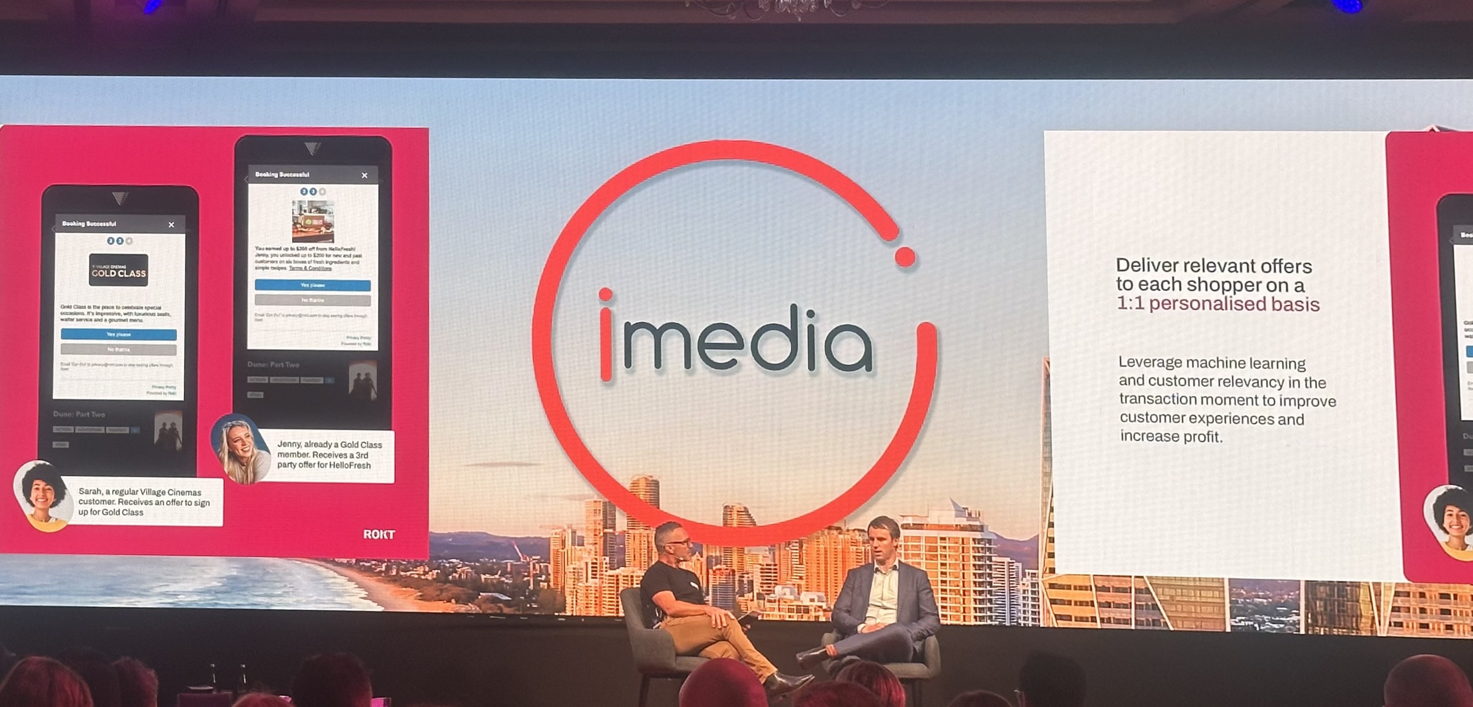
Rokt has also taken into account the need for consistency throughout the customer journey. We have crafted our widget technology to provide a native experience. And thanks to our machine learning algorithm, the offers shown, whether internal or third-party, will always be relevant to each customer. As the president of one of our retail partners noted, “With the customizability of the Rokt widget UX, our customer’s experience has not been disrupted, if anything it has provided them with an enriched experience offering them relevant offers after they have transacted on our site.”
“These concerns are merely perceived barriers, and with a trusted partner like Rokt, there exists a vastly untapped golden opportunity for e-commerce brands.”
“It’s a small opportunity”
It’s curious that brands are willing to designate much of their efforts into converting a customer early in the Transaction Moment only to pass up the opportunity to engage with them on the confirmation page when they are still very much receptive. Rokt drives meaningful results for our partners, including Fanatics who saw a 470% increase in yearly ancillary revenue generated by Rokt. Beyond immediate conversions and eCPM, the confirmation page presents the perfect opportunity to drive repeat purchases. Utilize the moment following a positive shopping experience to present an app download prompt or other loyalty actions. Not only will you be continuing your conversation with customers, but those who engage further have the ability to drive significant long-term value for your business.
Isn’t it time to reconsider your confirmation page?


